Understanding color is one of the most powerful tools a watercolor artist can master. Whether you’re painting sunlit landscapes, expressive portraits, or ethereal abstracts, your ability to choose, mix, and control color will directly influence the emotion, atmosphere, and clarity of your work.
Watercolor as a medium is especially sensitive to color relationships. Transparency, granulation, and the natural flow of pigment on paper all interact with color in ways that are unique compared to other media. In this guide, we’ll explore both foundational and advanced principles of color theory from a watercolor-specific perspective, covering traditional and modern color wheels, limited palettes, color harmony, emotional color shifts, and pigment behavior.
Understanding the Color Wheel: RYB vs CMY
Traditional RYB (Red, Yellow, Blue) Color Wheel
Most artists are first introduced to the traditional Red-Yellow-Blue color wheel. It’s been the standard for centuries in art education, especially in classical painting. In this model:
- Primary Colors: Red, Yellow, Blue
- Secondary Colors: Orange, Green, Violet (from mixing the primaries)
- Tertiary Colors: warm/cool red, warm/cool yellow, warm/cool blue
We’ll get into warm and cool colors in a bit, so keep reading!

The RYB wheel is easy to understand and has been used for a long time, but it isn’t always precise for watercolor mixing. For example, trying to mix a bright violet from red and blue pigments can be tricky, and you might end up with dull purples. The CMY model can help with this problem.
CMY (Cyan, Magenta, Yellow) Color Wheel
The Cyan-Magenta-Yellow color model is standard in printing and digital media, designed to achieve the widest possible range of hues with a limited number of inks. For watercolor artists, this model offers greater versatility and predictability in mixing colors.
- Primary Colors: Cyan, Magenta, Yellow
- Secondary Colors: Orange, Green, Purple
- Tertiary Colors: Red-violet, red, yellow-orange, lime green, torqouise, blue
This wheel allows for cleaner, more vibrant mixes across the spectrum. For instance:
- Cyan + Magenta = clean violet
- Cyan + Yellow = crisp green
- Magenta + Yellow = vibrant orange-red

Watercolorists often use this model when selecting triads for limited palettes because it allows a broad range of hues using fewer pigments. The paint colors generally recommended for this triad are phthalo blue (green shade), quinacridone rose, and Hansa yellow light.
Pro Tip: Regardless of which model you use, always test your own paints. Pigments vary widely even among paints labeled the same name. Create your own color wheel or mixing chart using your actual paints to see how they interact.
Why Is the Traditional Color Wheel Red, Yellow, and Blue?
The traditional RYB (Red-Yellow-Blue) color wheel has its roots in art history. It emerged during a time when artists had limited access to pure pigments and were more focused on the visual experience than the physics of light.
Historical Origins
- The RYB model gained prominence in the 18th century, influenced by theorists such as Moses Harris and Johann Wolfgang von Goethe.
- Renaissance painters discovered that red, yellow, and blue could be mixed to create a broad range of hues.
- These three primaries were codified into early color wheels and art education systems, forming the foundation of classical color theory.
Simplicity for Teaching
- RYB is easy to teach and visualize. The concept of three primaries forming three secondaries (orange, green, violet) is intuitive.
- It remains a staple in early art education and is often the first color wheel artists learn.
Practical Use with Traditional Pigments
- Historical red, yellow, and blue pigments, such as vermilion, ochre, and ultramarine, were among the most accessible and stable.
- Though the mixes weren’t always vibrant (especially purples), they were workable and became standard.
Today, the RYB color wheel remains a helpful tool for understanding the relationships between warm and cool colors, complements, and general mixing behavior. However, for precise and vibrant color mixing, many artists now turn to the CMY wheel.
Limitations of the Color Wheel Theories
The color wheel is a tool used by artists and laypersons to describe the color spectrum, particularly the RYB color wheel, which is often introduced to us as young children. As a result, it is considered general knowledge. Because of this, we tend to think of primary, secondary, and tertiary colors as fact, when in reality, it is just a theoretical way to describe a complex concept.

The color spectrum has been arbitrarily divided into 12 hues, but in reality, it is infinite. There are subtleties between each of these, and if you and I both mix a yellow we consider to be “warm yellow”, we will not end up with exactly the hue.
That being said, it doesn’t mean we should throw it out completely! Color wheels are an excellent way to understand color mixing and color harmonies. What I recommend for artists is to create color wheels using your own pigments and then really learn how the paints interact with each other, as well as the strengths and limitations of your mixing palettes.
Understanding Warm and Cool Colors
We assign temperature descriptions to colors. Orange is the warmest color, while blue is the coolest. So any color that moves to orange will be warm, and toward blue will be cool.
Historical Basis of Warm and Cool Colors
We cannot be certain when this officially originated, but it was a long time ago. It was based on metaphorical associations with heat and cold, where heat is represented by red, orange, and yellow, and cold is represented by blue, green, and purple. In 1672, Sir Isaac Newton wrote about his experiments with light and color. He developed the first version of the color wheel based purely on scientific and descriptive principles. In 1805, Mary Gartside, a watercolorist and botanical painter, was the first known theorist to classify colors as warm and cool, basing the split on the Newtonian color circle. In 1810, the poet Johann Wolfgang Goethe wrote a book about color and perception, describing warm and cool colors from an emotional and perception-based perspective, rather than a scientific one. Since then, numerous artists, scientists, and theorists have contributed to the understanding of this concept.
Again, in reality, it is a spectrum, and color “temperature” is just a concept, not a fact. Still, we can utilize it to enhance our art practice and to come together with a unified language to foster understanding across the field of art.
Warm and Cool Color Descriptions
The entire color wheel can be divided in half, with cool colors ranging from magenta (a purplish red) to green, and warm colors from red to yellow-green.

We can also describe each color as warm or cool. The tertiary colors specifically are broken into warm and cool versions of the primaries. Let’s take a closer look at those. There is some debate on this, but I will teach you what I find to be most intuitive and correct.
Warm red is a red that has an orange tint to it (moving toward orange). Cool red has a purplish tint to it (moving toward blue). Warm yellow is more orangy (moving toward orange). Cool yellow is more green (moving toward blue).
But then what do we do with blue? In my opinion, the tertiary colors on either side of blue are both warmer, so this is NOT intuitive; therefore, I don’t say “warm” or “cool” blue; I describe it as leaning toward purple or leaning toward green. However, tradition suggests that blues leaning toward purple are warm and those leaning toward green are cool.
Color temperature can also be used just to compare two different colors. For example, a warm blue is still cooler than a cool red.
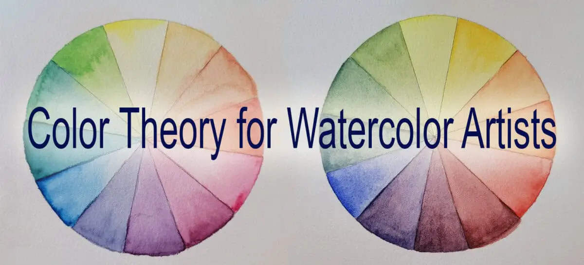
The picture to the left demonstrates how each color has warm and cool versions. Although green is cooler than yellow, it’s clear that the green in the left color wheel is much warmer than the green in the right color wheel.
So, understand that color temperature is relative, not concrete, but it is very helpful in creating a unified language around color theory.

Exploring Color Harmonies in Watercolor
Color harmony is the pleasing arrangement of colors that work together to create visual interest and emotional resonance. There are many different ways to compose colors in a painting to create harmony. Traditional approaches base the choice on the color wheel, choosing a palette that is monochromatic, complementary, analogous, etc.
In watercolor, where every wash matters due to transparency, understanding color harmony ensures that your paintings feel intentional and well-balanced.
Monochromatic
A monochromatic scheme uses a single hue in various tints, tones, and shades. This creates unity and simplicity. It’s great for:
- Mood studies
- Practice with values
- Serene, minimalistic landscapes or portraits
Monochromatic paintings can use any color you want. It can be a pure pigment or a color you have mixed, but maintained consistently throughout the painting. The mood or emotional impact of the painting will depend on both the color chosen and the range of values included.
If you choose a warm yellow color, it will evoke a sense of warm happiness, vibrancy, and energy; whereas indigo may feel moody, mysterious, or calming. In addition, if the value range is small, with little contrast, it may also feel calming and serene; whereas if there is high contrast from lights to darks, it may be a bit more emotional and impactful.

Complementary
Complementary colors sit opposite each other on the wheel (e.g., red and green, blue and orange, yellow and purple). They create strong contrast and visual energy.
When the colors sit next to each other, they make the other pop more and appear more vibrant. Mixing complementary pigments yields muted, neutral tones; ideal for shadows or blending natural grays and browns.

Monet used the complementary colors, orange and blue, with blues dominating the scene. The bright orange sun is a focal point, and variations of that hue are sprinkled throughout to create harmony.

Van Gogh skillfully used complementary orange-yellow and blue-violet to paint this dynamic scene. The colors are balanced, with almost 50/50 usage, creating a strong contrast while maintaining excellent balance.
Tips:
- Use one color as dominant and the other as an accent.
- Avoid using complements in full strength side by side throughout the entire painting. The eye will not have any place to rest or focus, and they may compete too much.
- Pick a focal point, and you can use the highest contrast there!
- Great for sunsets, fall foliage, or dramatic lighting scenes
Split Complementary
This variation includes a base hue and the two colors adjacent to its complement. It provides contrast without the intensity of true complements.
For example, instead of blue and orange, split complementary would be blue with red-orange and yellow-orange.
Split complementary schemes are excellent for balancing contrast and harmony in more complex compositions.

Munch uses blue as the primary color with red-orange and yellow-orange to complement it, creating a split complementary palette.
Analogous
Analogous schemes use 2-4 neighboring colors on the color wheel, like blue, blue-green, and green.
These schemes are harmonious and visually pleasing. They are similar to the monochromatic approach, but give a bit more variety. Instead of focusing only on value to create separation and contrast, you can also incorporate color variations. Value will still be the most critical part of this type of painting, though. Use variation in value and intensity to keep analogous paintings from feeling flat.

Renoir uses the interplay of greens, blue-greens, and soft yellows to create this calm, harmonious scene.
Triadic and Tetradic
These schemes are more complex and require more thoughtfulness to harmonize.
Triadic: Three evenly spaced colors on the wheel (e.g., red, yellow, blue). Balanced but requires careful value control.
Tetradic: Four-color schemes (e.g., a rectangle on the wheel like red, green, blue, orange). Vibrant but harder to balance.

Monet uses the traditional color wheel’s triad of red, yellow, and blue to create this vibrant sunset scene, excellently balancing the colors to create a pleasing composition.

Matisse uses a tetradic color scheme here with deep red, yellow-orange, blue, and green. the colors are highly saturated and bold, yet with the red dominating the interior, the green dominating the exterior with hints of each mixed in, it creates balance and harmony. Matisse is an excellent example of an expert colorist!
In both of these schemes, the colors can be mixed to create nearly endless hues. This approach poses a challenge because it can become chaotic and muddy if not handled carefully, particularly in watercolor, where colors blend easily without proper water control and layering.
When using these color schemes, plan where you want each color and let washes dry if you don’t want them to mix. It’s also a good idea to swatch and test your colors before you start, so you know how your paints will react together.
Generally, it is best to use one dominant color and apply others in smaller amounts. These schemes work best when you have experience managing intense hues.
Creating Color Harmony Across a Composition
Beyond choosing a harmonious palette, how you apply color matters greatly. Harmony is about consistency and repetition, not just the color wheel or palette..
Tips for Achieving Harmony:
- Repeat key colors in multiple areas.
- Use one color family to dominate, and others to support
- Echo accent colors subtly (e.g., sky blue repeated in shadows)
- Balance saturated and muted areas.
- Limit your overall number of distinct hues.
In music, songs have recurring motifs. In poetry, rhyme is used to develop a literary flow. Your painting should have visual echoes that make it feel unified as well.
A Case Study:
Imagine a misty forest scene:
- Dominant colors: green and blue-green (analogous)
- Supporting accents: reddish-brown tree trunks (complementary to green)
- Harmony is achieved by repeating those colors across the background, midground, and foreground.
This kind of planning turns a technically skilled painting into an emotionally resonant one.
The Power of Limited Palettes
Limited palettes are a watercolorist’s best friend. They simplify decision-making, increase harmony, and reduce the risk of “muddy” paintings.
Why Use a Limited Palette?
- Encourages consistency across the painting
- Makes mixing more intuitive
- Easier for travel or plein air
- Helps you focus on value, temperature, and saturation instead of chasing every color
- Economical start-up! It is cheaper to only buy 3 to 6 tubes of paint!
Popular Limited Palette Options:
CMY Triad
- Phthalo Blue (Green Shade)
- Quinacridone Rose or Magenta
- Hansa Yellow Light
This allows you to mix nearly every hue in the spectrum.

Those historically unavailable, Grankenthaler’s paintings closely resemble this color palette.
Earthy Triad
- Burnt Sienna
- Ultramarine Blue
- Yellow Ochre
Great for natural scenes, portraits, and vintage palettes.

Constable is a master painter who utilized historic, earthy pigments to create beautiful, realistic landscapes.

Vermeer is known for his love of ultramarine blue. Here he combines earthy pigments to create his famous portrait.
Vibrant Landscape Triad
- Cobalt Blue
- Permanent Rose
- New Gamboge or Azo Yellow
Warm and suitable for outdoor scenes.

Cassatt uses a subtle but vivid triadic interplay of cool blues, pinks, and soft yellows.
Split Primary Palette (6 colors)
- Hansa Yellow Light
- New Gamboge
- Quinacridone Rose
- Pyrrol Scarlet
- Phthalo Blue GS
- French Ultramarine
Suitable for anything you want to paint!
My recommendation for this is Daniel Smith’s Split Primary set. It is the perfect set of tubes for beginners and experienced painters alike!

Sargent utilized a surprisingly small set of bright, clean primaries, resulting in fresh, clean painting. He often traveled with two yellows, two reds, and two blues to match different light and landscape conditions.
Limited Palette Exercises
- Create a full mixing chart with just three paints.
- Try mixing neutrals using complementary pairs from your triad.
- Paint a full scene with only your triad.
Expanding the Limited Palette
The opposite of a limited palette is one with many “convenience colors.” Convenience colors are hues that are outside of the primary colors (on either color wheel). So colors such as green and purple are often convenience colors that people like to have in their palette. The benefit of this is that you don’t have to mix every color. There are sets that come with 12, 24, 48, or even more different hues! Just seeing those palettes overwhelms me, but everyone is different!
My recommendation is that if there is a color you keep going back to, you may want to add it to your limited palette. A muted olive green or a natural sap green is an option many people prefer. Though it is simple to mix green from yellow and blue, it is nice not to have to mix it every time.
Neutrals are also helpful convenience colors for a limited palette. Payne’s grey, burnt umber, and burnt sienna are popular choices for neutral grays and browns. You can mix these from the three primaries, but it can take extra time.
Ultimately, your color choice will come down to personal preference, but I would recommend starting with a limited palette and adding select convenience colors based on your painting style and practice.
Adjusting Colors from Reference Photos
Many artists rely on reference photos, but copying the exact colors often results in flat or unappealing work. Cameras distort light, crush shadows, and overexpose highlights.
Why Not Copy Photos Exactly?
- They often lack accurate color relationships.
- Shadows may be blacked out or too blue.
- Highlights can appear bleached and lose warmth.
Shifting Colors for Emotional Impact
Color is a powerful emotional tool. Don’t just paint what you see; paint what you feel or want the viewer to feel. Color can also be used to create focal points, where one may not have existed in the reference.
Examples:
- Shift yellows to warm oranges for nostalgic light.
- Cool shadows for a mysterious, tranquil scene
- Boost saturation in a street scene to create vibrancy and energy.
- Add a pop of saturated pure pigment to draw the eye to an isolated area.
Drills and Practice
Take one photo and paint it four different ways:
- Color matched to photo.
- Warmed-up palette for sentimentality
- Cooled-down version for drama or isolation
- Paint all light values in warm tones, and dark values in cool tones for a vibrant, modern art approach.
This helps you train your eye to interpret rather than replicate: a key skill in creative painting.
Bonus: Pigment Behavior and Its Role in Color Theory
Transparency vs Opacity
- Transparent pigments layer cleanly and are ideal for glazing.
- Opaque pigments can cloud layers and cause muddiness when overmixed.
Tip: Learn which of your pigments are transparent. Most manufacturers include this info on the tubes, associated pamphlets, or on their website.
Staining vs Lifting
- Staining pigments (e.g., Phthalo Blue) sink into the paper and are hard to lift once dry.
- Non-staining pigments (e.g., Ultramarine) are easier to lift or manipulate
This affects how you build layers and correct mistakes.
Granulation
Some pigments settle into the paper texture, creating beautiful, organic textures. Some ganulating paints are also a mix of different colors of pigments and will separate as they dry.
Some examples of these are
- Ultramarine blue: larger particles will settle into lower areas on the paper texture, making little clumps of darker color mixed with areas of lighter color
- Daniel Smith Cascade Green, which is a mix of Raw Sienna and Phthalocyanine Blue. The color will separate into warm, yellowish sections and cool, blue sections as it dries, due to the two pigments separating.
This works well for
- Rocks, sand, tree bark
- Cloudy skies or moody backgrounds
This is where it is important to know your own palette. Creating swatch sheets, mixing charts, and playing with varying amounts of water are great ways to get to know your colors. Some will look completely different from tube to dried in the palette to washed out on paper.
It is beneficial to consult the manufacturer’s information to determine the pigment properties, but nothing compares to experimenting with the paints yourself.
Optical Mixing
Layering transparent glazes allows the eye to mix colors visually. This is often more luminous than physically mixing the hues.
Example:
- Glazing yellow over a blue wash produces a glowing green, different from pre-mixed green.
Final Thoughts: Mastering Color Intuition
You can try mixing granulating and non-granulating pigments for surprising effects, layering opaque and transparent colors on top of each other to see the difference that changing the order of layers makes, and lifting different colors to reveal what happens under them! Though color can be considered a science, this is where the art comes in!
Understanding the theory provides you with the tools to make informed decisions, but the real magic happens when you apply those tools to convey mood, narrative, and emotion.
Here’s how to continue developing color mastery:
- Swatch and label all your paints.
- Make your own color wheels and charts with your pigments.
- Paint the same subject with different palettes.
- Use limited palettes regularly to strengthen color mixing skills.
- Reflect on your color choices after finishing a painting. What worked, what didn’t?
With watercolor, you’re not just painting what you see. You’re translating it through light, fluidity, and emotion. Color is your voice: make it sing!