Perspective is what gives your painting depth, dimension, and believability. Whether you’re painting a sweeping landscape, a quiet urban alleyway, or a fantasy scene from your imagination, understanding perspective will elevate your work from flat to fully immersive.
In watercolor, perspective becomes even more critical because of how light, texture, and softness interact with space. Soft edges, gradients, and transparency can either enhance the illusion of depth or completely flatten it. That’s why it’s essential to understand not only what perspective is, but how to apply it within the unique constraints and beauty of watercolor.
This guide covers the four major types of perspective: atmospheric, linear (1-, 2-, and 3-point), forced, and curvilinear, as well as tips for applying each to watercolor painting. We’ll explore practical drawing strategies, how to build believable depth using layering, and how perspective influences storytelling and emotion.
1. Atmospheric Perspective (Also Called Aerial Perspective)
Atmospheric perspective uses color, value, edge softness, and detail to create the illusion of depth. This approach is especially effective in landscape painting.
For atmospheric perspective, the key is to vary all of these things in the different sections of the painting. Each landscape can be divided into three parts: the foreground, the middle ground or middle distance, and the background.
Core Principles of Atmospheric Perspective
| Distance | Color | Value | Intensity | Edges | Detail |
| Foreground | Warmer | Dark to mid dark | Intensity, purest color | Sharp | Visible detail Small brushstrokes |
| Middle Ground | Transitional | Mid | Transitional muted colors | Blended | Looser details, fewer brushstrokes |
| Background | Cooler | Light | Softly muted colors pushed toward cool, not neutral | Soft or lost | Very minimal details As few brushstrokes as are effective |
This approach mimics how we perceive distance in real life. The farther away something is, the more the atmosphere affects how it looks. Light scatters, contrast drops, details blur, and colors shift toward blue or violet.
Watercolor Applications to Achieve Atmospheric Perspective
Watercolor is traditionally applied from light to dark. For landscapes, this approach can be especially effective. Starting with the lightest, diluted washes, using larger brushes, and working from the back of the scene (top of the page) to the front (bottom of the page) is generally the most effective.
Layering and glazing are your techniques here. Begin with soft, diluted washes for distant background shapes. Start with your cooler, more muted tones at low intensity. Often, using blue-grays or muted violets works well.
Edge control is essential. Bring each wash down the painting so that you are not trying to line up two hard edges; this will create soft transitions between your distances. For a more stylized approach, leaving those transitions sharp can be effective. Just remember, it will not look as subtle or realistic.
Generally, I try to paint each edge only once, planning so that the lighter washes blend and bleed out, then I go in and define the shape with the darker value.
In the background, the edges should all be soft and blurred. Using wet-on-wet is a great way to achieve that look without it being forced or looking overworked. In extreme cases (fog, smoke, mist), the background might lose almost all definition. Let it melt into the paper.
Starting wet on wet, then building detail with wet-on-dry as you move forward in the painting, is highly effective.
Negative painting also becomes very important to preserve light and edges in the distance. As you move into the middle ground, you will want to paint around the lighter shapes in the background. To keep the edges soft, you can paint with damp paint on damp paper in the transitional, middle ground of the piece.
As you continue to move forward with the composition, make sure you shift the color temperature, intensity, and value. Using large mixing wells in your palette helps with this transition.
Start with a limited palette. First colors lean toward blues and purples, and slowly add in your warmth (yellows, oranges, reds). In the middle ground, the colors will appear muted because you are mixing or layering the warms and cools, creating a subtle transition from cool to warm as you move toward the foreground.
You always want to start adding more paint and less water so the values begin to get darker. As you build up detail, you will add the darks or shadows later, but you want to establish the transition from light to mid value in your first washes.
Ensure the front of your midground has a soft edge down to the bottom of your page. This will allow you to establish that transitional edge only once, with the darker foreground colors, which is the next step.
Mix darker, warmer colors and define your foreground shape. Make sure to use negative painting for any midground elements that are important to your composition. Use wet- or damp-on-dry techniques here to keep crisp edges. Some edges can be left soft to create interest; you can soften slightly with a damp brush or tissue, or you can use damp-on-damp in small doses.
Once all your shapes are defined, it’s time to build detail. The details should be concentrated in the foreground shape. Think about your texture techniques, such as dry brushing, spattering, stippling, and your smallest brushstrokes. If you want to add some transitional detail in the midground, I recommend using larger brushes and more water with similar techniques. This approach will create looser detail and mimic that natural transition.
The final step is to bump the contrast. This is when you step back from your painting and, with a critical eye, deliberately add the darkest darks. This is where you add your intense shadows, keeping in mind the direction of your light source. This is what really sells the painting, whether it is realistic, loose, or abstract. The contrast of shadows is key to a deep, lively painting that is interesting and not flat.
In summary, create atmospheric perspective with these steps.
- Start wet on wet, light values, cool colors
- Move to damp on damp, mid values, muted, and slightly warmer colors
- Establish the transition from background to midground shapes in this wash
- Transition to wet or damp on dry, darker values, warmest colors
- Establish the foreground shapes
- Add details with dry brushing, spattering, and small brushstrokes to build detail, focusing on the foreground
- Finally, add your darkest values and shadows to bump up contrast and interest.
Where Atmospheric Perspective Shines
- Mountain ranges
- Seascapes
- Forests
- Moody skies
- Cityscapes in the rain or fog.
Examples of Atmospheric Perspective
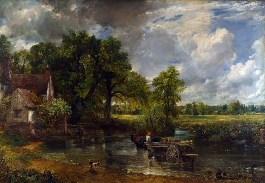
John Singer Sargent’s The Hay Wain uses classic atmospheric perspective, with cooler, less saturated colors in the background and few details, transitioning to warm, intense colors and more expressive details in the foreground.
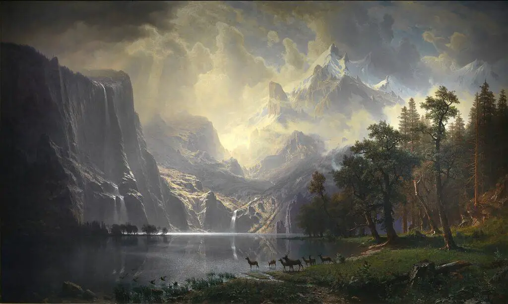
Albert Bierstadt, Among the Sierra Nevada Mountains, California, demonstrates a crisp foreground with hazy, soft distant mountains. This is the classic use of atmospheric cues.
Atmospheric perspective has been used for generations in all painting mediums, but it is especially compelling in watercolor because of the medium’s ability to create seamless transitions and layered veils of color.
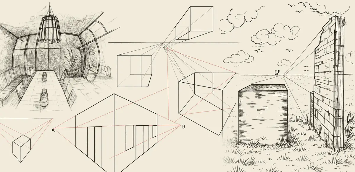
2. Linear Perspective (1-, 2-, and 3-Point)
Linear perspective is a geometric method of depicting three-dimensional space on a two-dimensional surface using vanishing points and orthogonal lines.
Whether you’re painting architecture, interiors, or even natural objects like rivers and paths, linear perspective helps you create structure and believable spatial relationships.
There are generally three types of linear perspective: 1-, 2-, and 3-point. Let’s look at each one in detail.
One-Point Perspective
- Has a single vanishing point on the horizon line.
- Commonly used when the viewer is looking directly at a flat surface, such as a road, hallway, or river
- All lines recede toward that single point, creating the illusion of depth.
Watercolor Example: A path receding into the distance, viewed straight on; a pier stretching over water; train tracks vanishing into the horizon.
Historic Examples:
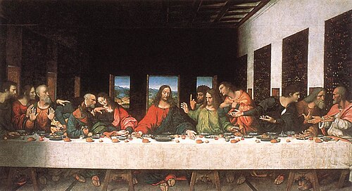
Leonardo da Vinci’s The Last Supper is a textbook example of one-point perspective; all lines converge above Christ’s head. Specifically looking at the ceiling details and the doorways on the side walls will show you the angle toward the vanishing point.
Pietro Perugino’s Delivery of the Keys to Saint Peter is another strong example. The vanishing point extends behind the central doorway in the midground of the painting. All lines lead there. The buildings in the midground appear flat to the viewer because one-point perspective is used instead of two-point perspective, which would create a more three-dimensional effect. The artist relies on shadows and shading for depth rather than on perspective.

Two-Point Perspective
- Uses two vanishing points on the horizon line.
- Used to depict an object or scene from a corner, such as a building seen at an angle or perpendicular roads.
- Horizontal edges go to different vanishing points; verticals remain upright and parallel.
Watercolor Example: Painting a village street scene with buildings on either side; sketching a cafe scene with tables and chairs viewed diagonally.
Historic Examples:
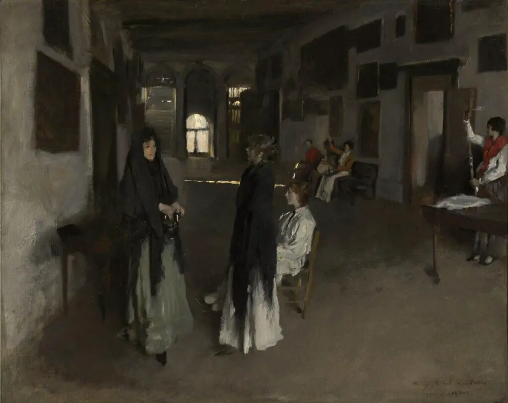
John Singer Sargent’s A Venetian Interior demonstrates two-point perspective in an interior scene. This view shows one vanishing point left of center along the horizon and a second vanishing point outside the right side of the painting, also on the horizon line. The door frame, bench, and tables all have perpendicular angles with one line pointing at each vanishing point.
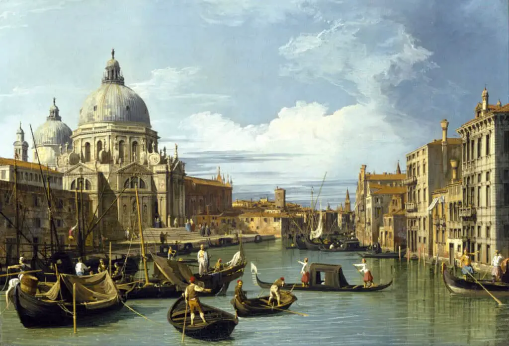
Canaletto’s painting, The Entrance to the Grand Canal, Venice, demonstrates two-point perspective with the accurately painted architecture. As with the painting above, one vanishing point lies within the painting’s border, while the other lies far outside the borders.
Three-Point Perspective
- Adds a third vanishing point either above or below the horizon line in addition to the two points on the horizon.
- Used to create a sense of height, as if looking up at something.
- Vertical lines also converge, enhancing the sense of drama or scale.
Watercolor Example: A bird’s eye view of a cityscape, a canyon viewed from above, or a view looking up at towering trees or skyscrapers.
Historic Examples:
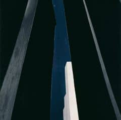
Georgia O’Keeffe’s City Night, 1926, is a perfect example of three-point perspective in action. You see the top of the white buildings angle sharply, and the vertical line tile in; this is because there are three vanishing points. Two along the horizon line, below the bottom edge of the painting, and on out the top middle.
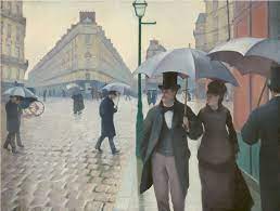
Gustave Caillebotte’s Paris Street; Rainy Day, shows a subtle three-point perspective. Streets and buildings recede to two points horizontally and vertically, the lines angle very slightly, suggesting a very high vanishing point straight above the middle of the painting.
Specific Tips for Accurate Linear Perspective:
- Use faint pencil guidelines to block in your perspective lines before committing to paint.
- Let one or more of your vanishing points fall outside the edges of the painting. This helps maintain realism in wider views.
- Keep your washes clean and layered so that perspective lines don’t get lost in visual clutter.
- Use cast shadows as directional lines to reinforce the vanishing point.
- Try sketching cubes or boxes in various perspective systems as warm-ups.
- Draw the horizon line and determine where “eye-level” is in your sketch phase.
- Practice changing eye level: low horizon for towering scenes, high for aerial views.
Linear perspective might sound mathematical, but when used loosely in watercolor, it helps ground your subjects in believable space without stiffness.
If you want to manipulate linear perspective for artistic effect, you absolutely can. My recommendation is to make it a difference that looks purposeful. Small changes in linear perspective will look like a mistake, but a significant, purposeful change will create a sense of drama that draws the viewer’s eye. It can create tension and emotion in your piece.
3. Forced Perspective
Forced perspective manipulates scale and placement to create visual illusions, making objects appear larger, smaller, closer, or farther than they actually are.
This form of perspective is less about technical rules and more about creative distortion. It’s used in photography, film, illustration, and art to create theatrical or humorous effects, or to place emphasis.
Core Concepts:
- Objects placed close to the viewer can appear massive if exaggerated in size.
- Background elements shrink dramatically when the scale is manipulated.
- Viewers’ brains “fill in” the spatial logic, so long as cues like contrast and overlap are present.
Where You See It:
- Fantasy art (a giant holding a tiny tree)
- Storybook illustration (mouse-eye views)
- Surreal compositions (floating islands with people at impossible scale)
Watercolor Tips:
- Use value contrast and detail to push objects forward.
- Use looser, cooler, and grayer washes to shrink background elements.
- Don’t be afraid to exaggerate. Subtle forced perspective often looks accidental. Be bold to achieve a purposeful, artistic effect.
Drawing Tricks:
- Sketch thumbnails to test different viewpoints.
- Lead the viewer’s eye with foreground shapes, like pointing limbs or long shadows.
- Make the horizon line low or high to emphasize vertical dominance or spatial compression.
Historic Examples:
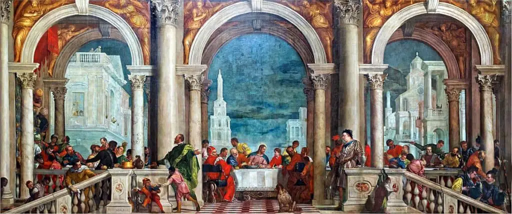
Paolo Veronese’s The Feast in the House of Levi subtly uses forced perspective. The background architecture appears very small to push it farther into the background and make the foreground house appear more grandiose.
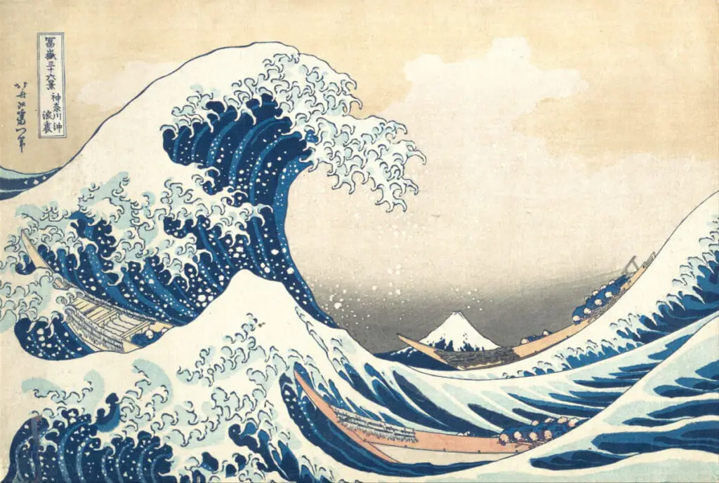
Hokusai’s The Great Wave off Kanagawa is an example of using exaggerated scale to force depth. The unrealistically massive wave dwarfs the great mountain in the background, yet it creates a sense of space and distance without relying on other typical types of scale.
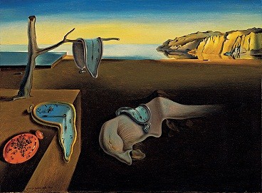
Salvador Dalí’s The Persistence of Memory uses linear perspective that is purposefully altered and exaggerated. The use of atmospheric perspective is also evident, but flipped: the background is right and warm, there are details in the cliffs that would typically be soft or obscured in atmospheric perspective, and the sizes of everything are altered and exaggerated, in addition to their shapes.
Forced perspective can be emotional, comedic, fantastical, or unsettling. Use it when realism takes a backseat to impact.
4. Curvilinear Perspective
Curvilinear perspective introduces bending lines and distortion to represent extremely wide-angle views. This technique simulates the experience of looking through a curved lens, like a fisheye camera.
Core Characteristics:
- Straight lines curve outward or inward as they recede.
- The horizon bends into a shallow arc.
- Vertical lines tilt as they approach the edge of the image.
- Uses five vanishing points: left, right, top, bottom, and center.
Where It’s Used:
- Urban scenes where tall buildings arc across the page
- Interiors with an immersive or exaggerated feel
- Sci-fi and fantasy worlds that bend space
- Surreal landscapes where the viewer’s vision warps
Drawing Tips:
- Start with a curved grid or overlay a fisheye reference image (a reference photo is very useful when starting to learn this perspective!)
- Keep the central elements “undistorted” for viewer stability and grounding
- Let the outer edges stretch and bend while preserving overall volume and form.
Watercolor Adaptation:
- Sketch grids first in pencil to plan curvature
- Use gradated washes that follow the arc of the space
- Layer values carefully to enhance roundness and avoid flattening
- Use curvilinear distortion in reflections or to simulate lens effects (e.g., globes, domes, bubbles)
Historic Examples:
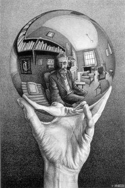
M. C. Escher is the most famous artist for curvilinear perspective. His pieces Hand with Reflecting Sphere and Balcony are clear examples in which spheres are used to create curved, distorted lines. These are not the only version of curvilinear perspective, but they demonstrate it exceptionally well. Horizontal lines are curved up and down rather than parallel. The middle is the least distorted, and the objects around the edges are the most distorted.
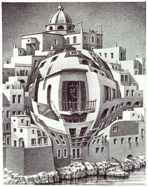
Curvilinear perspective is advanced but powerful. Even using just a hint of curve can create an energetic, modern vibe that breaks away from traditional composition.
5. Supporting Concepts in Perspective
Even without vanishing points or curvature, you can enhance spatial illusion using additional compositional tools.
Overlap
- The object that obscures another appears closer.
- Overlap with edge quality: hard edges in front, soft behind.
- Combine with shadows and color shifts for strong layering.
Size and Scale
- Repetition of the same object in diminishing size reinforces space (e.g., fence posts, windows, trees)
- Use known elements (a figure, a chair) to anchor the scale
Placement and Horizon Line
- Objects near the bottom edge feel closer; the top edge feels farther.
- Horizon placement affects drama:
- Low horizon: emphasizes sky and vertical objects
- High horizon: emphasizes ground and horizontal objects
- Low horizon: emphasizes sky and vertical objects
Cast Shadows
- Shadows project into perspective space.
- Use direction and angle to emphasize the light source and depth.
- Shadows can be longer and more distorted in 3-point and curvilinear scenes.
Together, these concepts are the glue that holds your spatial structure together, especially when working loosely in watercolor.
Putting It All Together to Create Depth in Watercolor
Not all depth comes from strict perspective lines. As watercolor artists, we have a unique set of tools that help suggest space, atmosphere, and distance, whether or not we’re following a formal perspective system. Let’s explore those intuitive and powerful techniques that help bring dimension to a flat page.
1. Overlap & Placement
- Overlap is one of the simplest ways to show which objects are in front. This helps establish visual layers.
- Vertical placement affects spatial cues. Lower on the page feels closer; higher suggests distance.
- Works particularly well with layered landscapes, treelines, and misty backgrounds.
2. Size Scaling
- Objects appear smaller the further they are from the viewer.
- Use consistent scaling for realism. Trees, rocks, people—each should shrink proportionally in the background.
- This method pairs well with one-point and atmospheric perspective for extra believability.
3. Detail, Texture, and Line Work
- Foreground objects have sharper, more detailed textures.
- Background objects fade, blur, or simplify.
- Use dry brushing or a fine liner for texture in the front.
- Let background shapes soften with wet-in-wet or glazing.
Tip: Thicker, darker lines = closer. Thin, light lines = farther away. Especially helpful in ink and wash techniques.
4. Color Temperature and Saturation
- Warm colors (reds, oranges, yellows) appear to advance.
- Cool colors (blues, purples, greens) recede.
- Highly saturated colors catch the eye and feel nearer.
- Desaturated colors suggest atmosphere and distance.
This concept is especially powerful in emotional storytelling. Want a cozy cabin to feel warm and close? Bathe it in yellow light and surround it with cool purples in the distance.
5. Value Contrast
- Foreground: stronger lights and darks.
- Midground: more neutral values.
- Background: compressed, subtle value range.
Use value gradients or jumps from light to mid to dark in order to draw the viewer through a scene.
6. Shadows and Light Direction
- Shadows anchor objects to the ground.
- Consistent light direction reinforces realism.
- Use crisp shadows in the foreground; let them blur with distance.
- Shadow color can shift temperature to reflect the environment (e.g., purple shadows on snow.)
7. Atmospheric Effects
- Soft glazes suggest fog or humidity.
- Lift pigment with a damp brush to create hazy distance.
- Use softening techniques to blend background shapes into the sky.
These techniques enhance atmospheric perspective even in otherwise flat compositions.
8. Edge Control
- Hard edges = close, crisp, and sharp.
- Soft edges = far away, blended, or unfocused.
- Use wet-on-dry for foreground precision.
- Use wet-on-wet to blur distant hills, trees, and clouds.
9. Foreground Framing and Vignetting
- Frame the composition with foreground elements: trees, fences, rocks.
- Use vignetting (softening or darkening edges) to direct focus toward the center.
10. Combining Methods for Depth
- Layer warm, detailed shapes in front of cool, soft ones.
- Mix perspective systems: atmospheric + one-point, for example.
- Use repetition, such as multiple objects (like trees or rocks) getting smaller and cooler in tone as they move back.
Final Thoughts: Seeing and Building Space in Watercolor
Perspective is more than a technical skill. It’s a way of seeing. When you understand how space behaves, you can manipulate it. You can lead the viewer’s eye, heighten emotion, and create compositions that feel grounded and alive.
In watercolor, structure and softness must coexist. Your lines and forms give the painting its skeleton. Your washes, glazes, and fluid transitions give it its body and soul.
Whether you’re anchoring a city street with 2-point perspective, layering blues into a distant mountain range, or distorting space with a fisheye effect, perspective is what gives your painting its sense of place.
Practice observing the world around you. Squint to see values, study how parallel lines converge, and notice how air affects color in the distance. Sketch from life. Break photos down into perspective grids. And most of all, experiment.
When you make perspective a natural part of your creative process, your paintings will feel more immersive, more emotional, and more alive.
By weaving perspective techniques together, you’re not just painting things; you’re building a sense of place, building a world for the viewer to step into. These tools help you guide the viewer’s eye, emphasize your subject, and evoke depth even in simple scenes.